
OLIVIA EVITT
Question 2 - How effective is the combination of your main product and ancillary texts?
Mise en scene
In terms of mise en scene, we wanted to ensure that continuity was shown through our ancillary task and music video in order to create synergy and intertextuality between the products. By keeping aspects of the mise en scene the same throughout, we were able to create iconography between the media texts allowing the audience to diverse into a world of familiarity according to the uses and gratifications theory.
-
The costumes decided in our treatment at the initial idea stage of our process remained the same throughout our music video and our ancillary tasks. We decided on 'indie' styled costumes in order to comply with the genre of our music video for our male singers, of whom wore clothing such as skinny jeans, shirts, bow ties, braces and brogues. Having each male band member in the same styled clothing allowed the audience to identify them as a whole, creating unity within the band. By glamourising them and having the males made to suit a specific style, an indie representation was created as endeavoured, which therefore complies with Dyer's star theory. For the girls featured in our music video, we chose to go for a 60's styled costumes. Myself and Rosie (the girls featured) both wore baby blue polka dot skirts/dresses with pin curled hair and converse. We looked identical, which therefore created unity and showed that we belonged together as one. We chose this era of clothing as the girls were only featured in the narrative/conceptual part of the music video (the tea party scene) which therefore fitted well and emphasised the vintage style created. The same costumes were used in our digipak, therefore creating iconography throughout our products. This also allowed the audience to create personal relationships according to the uses and gratifications theory as they were able to being to familiarise the characters and identify them through the continuity in use of costumes.
-
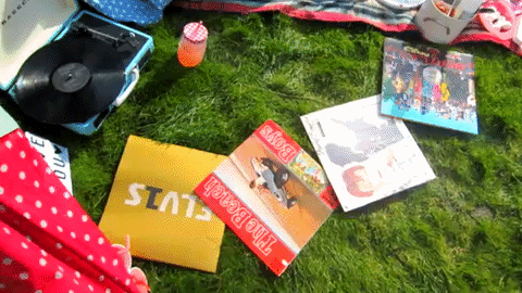
Props were a widely used and important element of our music video, particulary for the narrative/conceptual scenes (tea party). After researching into the variation in props that we endeavoured to use, we gathered a strong selection. In order to emphasise and comply with the indie vintage style created, we chose a fun random selection of props such as a record player, inflatables, cupcakes, picnic blankets, a radio, fairy lights, etc. We took inspiration from Alice in Wonderland and were also inspired by artists such as The 1975 and Megan Trainor. Through props being such a big element of the narrative/conceptual parts of our video we were able to ensure that our chosen indie-pop style was being created to it's full advantage. This also allowed us to comply with Hall's theory that the audience decode the meaning of media texts in the way in which we intend them too. We featured the same props in both of our ancillary tasks. For example, close-ups of the props were used for the internal panels of our digipak and a mid shot of our tea party scene was used for the magazine advert. Through featuring these props in our ancillaries continuity is shown within our products and deeper connotations can therefore be created according to Barthes enigma code. For the performance elements, our choice of props was very different. The only form of props featured were dark coloured instruments used by the band members, speakers, and fairy lights on the background. The constrast from using a wide range of props in the narrative scene to using minimalistic props in perfomance scene was an example of binary opposites within the elements of our music video. The purpose of keeping the props simplistic within the performance scene was to ensure the main focus was on the band, supporting Dyer's star theory.
-
We endeavoured to keep the lighting high key throughout all of our media products. For the music video, we used different methods of lighting. For the narrative scenes natural lighting was used as the video was shot on a bright sunny day which was very much to our advantage. We edited the brightness of the shots slightly in order to enhance the colours. For the performance scenes, we lit the shots using bright pink stage lighting and covered the black background in fairy lights. This was a subtle way to introduce the fun, bright 'pop' style seen in our narrative. High key lighting was used in both our digipak and magazine advert in order to maintain the same positive playful mood throughout. The use of high key lighting also contributed to the respresentation of the artists, allowing the audience to create personal identity and familiarise themselves with them according to the uses and gratifications theory.
-
In terms of location we chose to show the tea party scene (back garden) seen in the music video in both our digipak and our magazine advert. We didn't want to mix it up by showing the location of the performance scenes in our ancillaries as it would lack continuity and the audience would be unable to identify the ancillaries as a part of our main product. We chose to use the scene from the narrative oppose to the scene from the performance as there was a lot more to play around with. The quirkiness and originality of the location added to the indie style of our work; these characteristics are conventions of the genre. It also allowed for deeper connotations through the minimalistic images used in the digipak and the magazine advert, an example of Barthes enigma code, allowing the audience to decide what they want to make out of a media text according to the reception theory.
-
Through showing continuity in the mise en scene of our ancillaries and our main products synergy is created within them therefore complying with Swales theory of family resemblances.


Perfomance element of music video

Performance element of music video

Featured in music video
Perfomance element of music video
 Location used on digipak |  Location used on magazine advert |
|---|
Camerawork
Within our music video we used conventional camera shots such as close-ups, mid-shots and long shots. For both the front cover of the digipak and the magazine advert a mid/establishing shot was used in order to capture the location and 'set the scene' as a way of synergising/introducing the music video.
-
Various close ups were used in the performance element of our music video. We focused on the band members in these elements more than in the narrative to maintain the audience's focus on the band and their music, allowing for diversion according to the uses and gratifications theory. Extreme close ups were used on props within the narrative element oppose to on the characters as these scenes were more about creating a hyperactive, fun playful representation of the band opposed to the more professional representation created in the performance scenes (Dyer's star theory).
-
Establishing shots were used in the music video to allow to audience to take in all aspects of the setting and the props used to emphasise the lighthearted playful mood created. The same shots were used in our digipak and magazine advert as shown above. Extreme close ups were also used for the internal panels of our digipak. These were effective as it put the audience's main focus on the images used; in particular, the shot of the female character (myself) whispering in the male band members ear. By including no other aspects on the digipak panel the image creates connotations and innuendos, allowing the audience to assume deeper meanings according to Barthes enigma code.
-
Extreme close ups were used on the female characters in order to capture their expressions, glamourise them and show their femininity. This complies with Mulvey's male gaze.
-
Panning was used at the beginning of our music video from the 'PINK LEMONADE' letters up to the male band members of whom lip sync the first line of the sound track. The use of panning was a smooth subtle camera technique which allowed us to introduce the setting and the characters.
-
Ariel shots were used within the stop motion of our music video in order to capture the record player and vinyls from a POV shot; this is further explained within the editing section.
-
A shot reverse shot was used in our music video to show a close up of me squirting cream in rosie's mouth (femal character) which then switched to a shot of Jamie (male character) running with Harry (the dog) and then back to a mid shot of Rosie and I laughing. We found this camerawork technique to be really fun to use and effective.

Editing
Our music video was edited using the editing software Sony Vegas Pro. After experimenting with other programmes such as iMovie for our preliminary task, we identified that we were more confident with Sony Vegas Pro and felt it was the most suitable and preffered programme to use for this project due to its ease of use and wide range of tools that we could experiment with. This software was used for our film opening in AS Media last year, therefore this time round we endeavoured to develop and improve our editing skills.
-
All of the shots within our music video were enhanced using the colour corrector tool, the brightness and contrast tool, and the saturation tool. Although the music video was shot on a sunnt day, we felt that by editing the shots the colours became emphasised effectively and the colours really stood out to compliment the fun playful vibe presented throughout.
-
Colour correcting was also done within some of our performance shots of which we felt lacked enough pink lighting. By correcting the colours, the shots appeared much brighter and more aesthically pleasing, allowing them to correspond with the 'pop' vibe within our genre therefore being an example of belonging according to Swales family resemblances.
-
A very successful editing technique of which was used within our music video was stop motion. We took pictures of the record player and vinyls and changed their position slightly in every shot to create a 'stop motion' effect. We corresponded them with the beat of the song in order to emphasise the effect of the change in shots by making them in time with the music. We found this editing technique really effected, therefore it was repeated in other aspects of our music video.
-
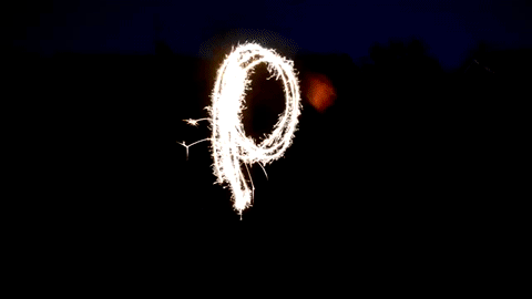
We included a sparkler scene in the bridge of our song in order to show a third element to our music video. After identifying that the shutter speed of our camera had to be adjusted, we shot sparklers spelling out 'PINK LEMONADE' at night time. The shot turned out really well, and using the colour and brightness corrector we edited them to brind out bright white/yellow colour of the sparks and darken the background as much as possible. We then edited the images together to create a stop motion effect of which works really well as a third bridge element within our music video. I believe this element really brings originality to the video and is an unorthodox element to include, supporting Neale's theory that genres are instances of repetition and difference.
-
We also used fades and overlays of shots within this bridge element in order to show different camera shots of the sparklers at one time. This made the shots appear much fuller and more effective, and by adjusting the transparency the cuts between the shots were smooth and subtle.

-
For our ancillaires, we used the editing software Corel Draw to create and edit our magazine advert and digipak, however after experimenting it seemed to be a method of trial and error as we found that it did not have the most sufficient tools that we were looking for to edit our images to the best of their ability. Therefore we switched too Corel Photo Paint and found that this programme was much more suited to our editing needs. The images were enhanced in colour, brightness, saturation and constrast in order to match the shots of our music video. By maintaining the same balance in the editing of our ancillaires and main product continuity is shown, therefore allowing the audience to identify that the media texts belong together as one, which is an example of both personal identity (uses and gratifications theory) and repetition (Neale).
Typography
-
No typography was used in our video as we didn't want to take the focus off of the characters (artists), however due to props being a huge element of our video, we chose to create multicoloured cardboard letters to feature in our video that spelled 'PINK LEMONADE' - the title of our soundtrack. This was an originial unorthodox example of typography, and a fun way to incorporate bright lettering in our music video. These props were featured in our digipak and our magazine advert as they showed the title of both ancillaries in an organic way making it less constructed (Dyer's star theory) (Difference; Neales theory).
-
The typography chosen to feature on our digipak was a sans serif relaxed handwritten styled font. We didn't want anything too bold, as it would remove the lighthearted pop theme presented throughout our products. The same style font was featured on our magazine advert, showing continuity and repetition.
-
Typography was used on one of the internal panels of our digipak (shown below) in the top right hand corner making it the second thing noticed in the audiences line of vision. We chose to use a line from the lyrics of our song 'can you use the spare bedroom?' over an image of the female character whispering in the male characters ear. As a result, innuendos are created and the audience diverse (uses and gratifications) and have the ability to create deeper connotations - an example of Barthes enigma code.


